
I came back from Melbourne with 318 photos taken in the city, it's art galleries and museums. Why did I take photographs of these 318 things and not the thousands of others I saw?
As I was photographing I was asking myself why do I like this? What is it about this scene or artwork that I like? I wanted to identify what I enjoyed seeing so I could incorporate it into my own work. It turned out that the elements I was most interested in were:
- Line and graphic quality (typical of prints)
- Symmetry
- Reflections and light
- Pattern and repetition
- Shape
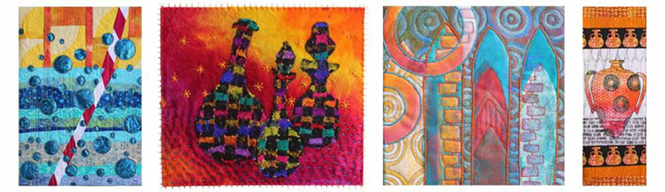
- Stories and Characters
I feel that line & graphic quality, symmetry and pattern are well represented in my own work whilst reflection & light, shape and stories & characters are elements that I use less often. This exercise has allowed me to identify the elements I might like to incorporate more often to improve my own satisfaction with my art work.
Of course many things were photographed because I liked more than one aspect of the scene. Other things I found interesting were:
- Colour
- Movement
- Texture
- Contrast
- Medium
- Subject matter
I also took some pictures purely because I liked the way the objects were displayed or the way the audience could interact with them even though I didn't particularly like the objects themselves.

One of the most striking artworks we saw was this large sculpture by the SO-IL design firm at the National Gallery of Victoria International. I liked this one for several reasons. Firstly the bright, glowing colours and sharp angular shapes but also the contrasting grey graphic lines behind it formed by the gallery architecture. The reflections in the glass also added more interesting lines and angular shapes.

I did not like the objects displayed inside the pyramids - I think the artwork would be better with nothing inside at all.

The sharp angles of the display plinths arranged in a curve added to the artwork and emphasised the angles. It looked especially good from the balcony.

Here you can see the contrasting grey background with it's sympathetic angular lines which I liked. Had this been displayed against paintings I don't think it would have looked so effective.


The reflections of lines in the building add an extra element to the sculpture.

I think it will be fun to play around with this image in PhotoShop

I'll show you some more photographs from Melbourne in my next post. I'm hoping to print some and use them in my sketchbook soon.
No comments:
Post a Comment